Sunday 30 September 2012

Research and Planning - Music Collage


Here is my music collage, this will help me to plan out my Pop magazine in the future.

  • Information and gossip (especially about celebrity relationships e.g. break ups) about popular 'pop-stars', actors and TV celebrities.
  • Poke fun at pop-stars, celebrities etc.
  • Music band 'gigs' and 'tours' across the country.
  • Music and film recommendations.
  • Fashion tips.

Saturday 29 September 2012

Research and planing - Analyse 2 Music Magazine Covers Part 2


We  Pop


Here is the second 'Pop' magazine I'm going to be analysing, 'We  Pop' is another famous 'Pop' magazine in the music industry.

The main image on the cover is singer-songwriter, Katy Perry. Having Perry' on the front cover will attract her fans into buying this magazine, assuming it will be about her. The type of audience that will read the magazine will more likely be teenagers, again like 'Top of the Pops' it is also appropriate for girls too, because there is a small photo of 'One Direction's' 'Harry' and his six pack.

Katy Perry's camera angle is a 'Medium Shot'.

Some of the cover lines fonts are bold, like the main cover line for example, 'KATY PERRY'. It's orange and bold grabbing the audience's eye. The rest of the font is normal, but some of the cover lines have a bold background to make them stand out.

"He hadn't told me..." fans and audiences will be urging to read what Perry' says inside because it leaves a cliffhanger with the '...', it also says 'You'll never believe what she says inside' under the caption.

The barcode just above the footer bar tells the readers how much the magazine costs, what issue number it is and what month it's updated to. It also has the web address underneath it in case the audience want to visit the website and get more details.

On the front cover, one of the small images is about fashion in the music magazine. This could be advertising the latest trend of clothing and could also be a musicians style of clothing the magazine editors are reviewing.
The footer bar on the bottom of the cover prepares the audience for what is to come while they're reading the magazine.


Research and planing - Analyse 2 Music Magazine Covers

I have decided to design a 'Pop' music magazine for my first project in AS Media. I picked the genre 'Pop' because it is a very popular style in the music industry.

For this blog post, I have chosen 2 'Pop' magazine covers to analyse. I am analysing these 2 covers because they will help me to design and produce my own music magazine cover.

Top Of the Pops

The first 'Pop' cover I have chosen to analyse is 'Top of the Pops', this magazine is one the most famous 'Pop' magazines in the music industry.

The main image on the front cover is the famous 'Pop' singer, Jessie J. This will make the audience assume that the magazine will be about her and will persuade her fans to buy it. The font is bold, which makes it easier to catch the audiences eye and drag them to read it.

Jessie J's type of shot on the cover is a 'Medium Shot' (head to waist.)

The caption "I've Beaten My Haters!" is in capital letters, this will attract the audiences attention making them want to know what this means. It could mean Jessie has had to deal with haters during her fame and now she is finally not letting them get to her.

This magazine looks most likely appropriate for teenage girls. I can prove this because the font colours (Lilac, Red and Fuchsia) are more 'girly' than boy's colours.

There is a magazine header bar just above the masthead containing the 'BBC' logo. This tells the audience that the BBC own 'Top of the Pops'. There's also a quiz with 2 characters from 'Glee' testing the audience to see 'Is she stealing your crush?'. The barcode is at the bottom of the magazine, this could be because it will be easier to see the price and it won't hide any of the photo's and cover lines.

I also think the magazine is for teenagers because the cover has images of young famous celebrities and the cover lines are dedicated to young teenage girls too e.g 'Who's The Fittest? Justin & Harry battle it out' and 'Your Most Embarrassing body worries Solved!'.  Teenage girls today are mostly mad about boys, body worries and fashion. Magazines like this help us girls to feel more confident while we're reading because there are other celebrities who worry about silly little things because they have problems like us too.


Thursday 27 September 2012

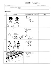
Research and Planning - Media Shots

Here are my drawings of different types of media shots, they will help me in the future for my media assignments.


Research and Planning - Magazine Cover and Contents Page Evaluation


Here is my Magazine Cover and Contents page.

I have recently improved my magazine cover using the comments from the students I interviewed a week ago. I took their advice and used it to make my magazine more informative and entertaining.
I have changed the model on my front cover to a real student from my college, I didn't think using an image of a random student taken from Google would look as good on my cover. I stayed with the '3 colour rule' and was quite pleased with how the colours turned out because I actually thought they were too bright, bold and would clash.

I think the font is just the right size and also the Masthead fits well! The font sizes aren't taking over the whole page(s) and it's easier to read, but I do think I could've picked a better font.

Part of me thinks the photo's are great and useful, but to be honest, I don't think there are enough to show and promote the college. I do however like the front cover, because the lighting was just perfect and it didn't make the photo look too bright or give uneven colouring.


I used Photoshop for my front cover and I'm glad to say that I'm happy and proud of it! From what I can see there isn't a piece of brick in the background (I took the photo of the student leaning against a brick wall.)

I also used InDesign to create my contents page. I think I have included just enough events & stories (Cover Lines) for my front cover and contents page. Unfortunately I wasn't able to find a lot of events to include in my magazine, but I think the ones I used were still useful and informative.

The front cover was done in under an hour, I was given a lot of time to design my cover but I used the wrong image for my model. I was mean't to use a medium close-up, but instead I used a medium shot of the student. Fortunately I found an MCU in my photo album and was able to continue on improving my magazine.


Friday 21 September 2012

Research and Planning - Improved Magazine Cover, Includes Contents Page


Here is my improved magazine cover!
I used my interviewees comments to help me make my magazine better.

I've changed the model from a random women I found on Google to a real student from my College.
I kept to the '3 colour rule', but this time I used green instead of blue because it'll make my magazine cover eye catching for my audience.

I've also changed the title's (College) font from 'Arial Black' to 'Old School', to give it that college theme and I've added some backgrounds to the cover lines so they stand out to the audience, persuading them to read the cover.


This is my Contents page. I thought taking photos of College life would be great to add onto my contents page, because they'll give a good view for the audience to see 'What's happening' and 'What is College life like'.

I also added some brand logo's like 'Costa' and 'Go Ape because they were mentioned on the front cover and inside the magazine. They'll help the audience to know what/ where everything is.


Here are the photos I have taken around college, BUT they weren't included in the magazine.


These photos aren't in my magazine because some of them were either too blurry or they were no longer needed.


 These are the photos I used for my magazine


I used these photos for my magazine cover and contents page because they were much clearer than the others and matched the cover line stories.

Wednesday 19 September 2012

Research and Planning - Magazine Cover Interview


Here is my interview for my magazine cover. I've interviewed two people from my college and asked them questions about what they think of it. They gave me lots of good and honest feedback which I used to help improve my cover.

Tuesday 18 September 2012

Research and Planning - Magazine Masthead Fonts

These are my fonts made to match each magazine Genre. I searched on the internet and font 'Dafont.com' (this website helps you to pick any font you want, helping you to match your theme).

Popworld

I wanted a 'Pop' related theme for my magazine title so I clicked on 'Groovy' Font. I liked this font because it gives a groovy, old fashioned, music effect, I also like the purple colour too because it's not just for girls it can also be for boys. I think Teenage audiences will like this font and colour because both sexes will find it attractive and unusual.

Death Metal

I wanted to pick a 'Gothic/Horror' font type to match with the magazines theme so I chose 'Black Asylum' font. I searched through a lot of Gothic fonts but some were either too gruesome or cartoon like. I picked this font because I found it very creepy and appropriate for the magazine and it's type of audience.

Popcorn

I wanted to use a 'Film Style' font e.g Star Wars, The Avengers, Transformers etc. to blend in with the magazines theme. I picked the 'Avengeance Heroic Avenger' font because it reminded me of the 'Stan Lee'/Action Hero comic books, which I think will help the audience to recognise the film 'Genre'.

Friday 14 September 2012

Research and Planning - Interview Questions

My College Magazine questions for interview

Today I'm going to be asking my target audience some questions about my College Magazine cover, hopefully I will get some good and honest feedback to help me improve my magazine.


1. What do you think of the front cover?
2. Would you improve the magazine cover and if so, what would you do?
3. Do you think the cover is informative? e.g. help you to know the latest events and clubs?
4. If you had to buy the magazine, would you actually consider buying it?
5. Out of 10 what would you rate this magazine?


Research and Planning - My College Magazine Cover

Here is my first draft of my College Magazine cover. I am going to list and ask some questions for my target audience and get their opinions on what they think of my magazine cover e.g Will it need improving? Is it appropriate? etc.

Wednesday 12 September 2012

Reasearch and Planning - Medium Close up's


Here are 4 images, they've have all got something in common, all are medium close ups. MCU's are shots which view the persons head down to the top half of their body.


Tuesday 11 September 2012

Research and Planning - College magazine analysis


This is definitely a college magazine, the masthead 'Ridgewater College' helps the audience know it's about a college.
Underneath the masthead there is a season and a year 'Spring 2009'. Each magazine must be written and given each season holiday e.g. Summer, Autumn & Winter.
The main picture's location looks like a study/educational area. The magazine doesn't have a barcode or the price, so it's definitely not a professional magazine, i.e you don't have to pay for it. It's a college magazine designed and made by the students.
Looks like an American college because there's the American flag behind the young woman. The cover lines give small previews of what articles are inside, also persuading young students to join their college to make their dreams come true by showing a small preview of an older college student achieving his dream.


Research and Planning - Film Review


Here is a 'Harry Potter and the Deathly Hallows Part 2' magazine film review I designed.

1) First I went on to the 'Empire' website and searched for a film review, then I copied and pasted one on to a Word Document.

2) I saved the document to use later. I dragged the image of the character (Harry Potter) which was attached to the review on to my desktop.

3) Then I used the software, 'In Design' (quite like Photoshop but for Word Documents) and then I inserted 3 margins onto my A4 page, which helped to space out my text.

4) I clicked on to 'File', then 'Place', allowing me to insert the film review into the margins.

5) After that I dragged the image from my desktop onto my A4 page and placed it below the text.

6) Then I clicked on the 'Rectangle tool', picked the colour Lilac and covered the whole page. At first the page was opaque but I right clicked and chose 'Text in Front', making the text stand out.

Friday 7 September 2012

Research and Planning - Photoshop challenge

This is another Photoshop challenge.

1) Open up an A4 document on Photoshop.

2) Then open up a 'Text' box to write in. I used 'Century Gothic' font, size 24, then changed the font colour to red.

3) I Painted the background blue, then I clicked on to 'Layer' then 'Layer style' and then on 'Drop Shadow' for a good shadow effect.

4) Using the internet (Google) I found an image of Robert Pattinson and placed it underneath my text.

5) I used the 'Brush tool' to change his hair colour.

6) Finally, I used the 'Brush tool' again to create a rough border.

Research and Planning - Skin Tutorial

Before

Today in Media I had to learn 'How to Airbrush'. Air-briushing helps to hide the blemishes we have, using Photoshop is a great way to hide them.
Here is a picture of a model, as you can see she has quite a few blemishes.

1) I used the 'Spot Healing Brush Tool' to help get rid of her spots.

2) After that I blurred the whole image by clicking 'Filter' then 'Blur'. I blurred the picture because she had a really shiny face.

3) The image looked quite cartoon like at first after blurring, so I used the 'Opacity' button to help make her look less like a cartoon and more of a model.

4) Now it's time for the fun bit, giving her a makeover! I used the 'Brush Tool' to apply make-up to her eyes, mouth, cheeks and I've even changed her hair and eye colour.

Voila!!

AFTER!!


Wednesday 5 September 2012

Research and Planning - Movie Poster

 Before

Here is a poster from one of the Harry Potter franchises, using this poster and the image of 'Buzz Lightyear' from the film 'Toy Story', I'm going to put Buzz's face on to 'Voldemort's'.

1) First I put both images on to Photoshop, then I used the 'Elliptical Marquee tool' and circled around Buzz's face.

2) Then I cut out Voldemort's face and dragged the circled Buzz face on to the poster.

3) I fixed the size and made sure it fitted well.


+


=


AFTER!!

Research and Planning - Photoshop Tutorial

This is my Album cover I put together using Photoshop. I have used Photoshop before I started college, but was never very good, the only thing I used was airbrushing. Today in Media I learned a lot about using Photoshop.

How I made my CD cover

1) First I gathered 3 photos (that were already in my Photoshop folder) on to Photoshop, these images were of a: CD, trumpet and a music key background.

2) I used the 'Elliptical Marquee Tool' to surround the CD, once circling the CD I dragged it to the musical keys background image.

3) Using the same process on the trumpet image, but this time I used a 'Magic Wand Tool' and clicked on the white background, I then right clicked and selected 'Similar', dragging the trumpet to the photo of the CD and mucic key background.

4) I changed the colours of the CD and trumpet by clicking 'Image' and then 'Adjustment'. This allowed me to choose the colours and pick how I wanted my CD cover to look, I chose 'Colour Balance....'.

5) After that I clicked on the 'Text' tool and typed my name on the cover, I also changed the size and font.

6) FINALLY, I changed the original background style by clicking on 'Filter' and then 'Distort', then used 'Wave'. Voila  the background on the CD is wavy.