Wednesday 13 March 2013

Evaluation: Question 7 - Looking back at your preliminary task, what do you feel you have learnt in the progression from it to the full product?


As you can see my front cover for the Preliminary task has changed drastically compared to my Music Magazine, the college front cover looks very untidy and there is a lot of unused space, i have now learnt how to keep the text inside of the margins with the rest of the coverlines to make them look neat and organized.

The models photo on my college magazine doesn't look professional enough at all because it was taken on a digital camera which doesn't give the best results when taking photos for a magazine whereas for my music magazine, I used an SLR camera to take my photos, which makes the photos clearer to see. The models photo was taken in front of a brick wall so it was very hard for me to remove the background on photoshop and the lighting on the photo looks no where near professional looking. On my music magazine, however, the models photo is clearer and it was much more easier to remove the background behind the model because i used a white sheet to take my photos, which made the models outline look smooth and normal looking whereas on my college magazine the lines were crooked and look abnormal.

The clothing for my college cover looked too simple unorganized, my music magazines clothing looked tidy and formal, also the hair and make-up made her look like an actual pop artist, I noticed while research pop magazines that celebrities always looked perfect on magazines. The font i used for my college magazine was too basic and i only changed the size a few times just by stretching it instead of doing the better and easier way by just typing in a number for the size of font that i wanted. My music magazines font looks so much better compared to the other front cover because it's more eye-catching for the readers, it is in a range of different sizes but not in a ridiculous way, I used capitol letters to make the font and coverlines look shocking for the reader, so when they read it they'll know that the article is going to be interesting to read.

Masthead on the college cover looked very unusual and I don't think the font was a good choice either, for my music magazine I wanted to make the Masthead stand out so I used a similar font like the 'Top of the Pops' magazine and coloured it purple, I also let my model wear a purple cardigan for my front cover because I thought it would make the model and the masthead stand out to the readers.


Again you can see that my contents pages have also changed a lot, my college contents page looked more like a leaflet than a contents page because I only used one column  a few photos a there wasn't a lot of information whereas in my music contents page it definitely dos look like a music magazine contents page after researching other music magazines. I used two columns instead of one and i even made them transparent so that the readers can still see the model posing, I didn't use a lot of photos like i did with the other contents page as I thought it would look too much and not look like a proper magazine.

The 'Features' and 'Exclusive' column is easy to read because I used black, bold font and also put the sub-headings in capital letters to make them stand out and readable, whereas in the other contents page I used a mixture of colours which made it hard to read and it just looked plain.The photos I took for my college contents page don't look as professional like the music contents page because I took them at random moments where the models were't really expecting it took make the contents page realistic instead of making them pose, and they are dressed too casually but my music magazine contents page photos do look more professional and better because of the SLR camera that I used and also styling her hair & make-up helped to make the contents page look like a real music magazine. 


Evaluation: Question 6 - What have you learnt about technologies from the process of constructing this product?

I have used IShowU to make my podcasts.
A Mac to design my magazine and use the softwares.
Made creative presentations to present my media ideas and plans e.g. Age, Gender


Directed to this website by a photograph and read the description

Helped me to edit my photographs for my magazine
Took clear photos of my models, made them look professional


Helps to view my images

Blogger is the website i have used to make blogs about my Research & Planning

Saturday 9 March 2013

Evaluation: Question 4 - Who would be the audience for your media product? Why

This drawing represents my target audience (a college student), She is 18 years old wears jeans, bold colours and flat comfy shoes. My magazine is for 16-19 year old teenage girls, so my magazine will definitely be perfect for 'Jennifer Miller', as she is 18 years old which is within the age range. My magazine is about Pop music e.g. Taylor Swift, One Direction, Katy Perry etc., gossip, make-up, and fashion so this magazine would persuade my target audience to buy my magazine because it will have information & gossip about their favourite pop star, make-up brands and the latest clothing of the season.

Evaluation: Question 3 - What kind of media instiution might distributeyour product and why?

Front CoverContents PageDouble Page Spread

Please click on the images and they will direct you to my Flickr account for full information. :)

Thursday 7 March 2013

Evaluation: Question 2 - How does your media product represent particular social groups?


Posture/Gesture - Both of these photos have similar posture, they both have one arm touching their neck and hair, they also have a straight posture and one arm by their side this  makes them look vulnerable to the reader, but both of the photos look relaxed, relaxed to their rise to fame. My model would attract audiences (16-19),judging by the way she is posing, she looks like an Independent popstar who will be able to inspire her young audience to follow her, she has also achieved her dreams and a lot of young people will aspire to that.


Angle - The angles are eye level, so the readers can still see the 'Popstars', can only see the photo on the lefts face as she is looking directly at the camera, she looks friendly which invites the readers to look and get to know the 'popstar', whereas in the right photo she is looking away from the camera as if she doesn't want anyone to know her business.

Shot Type - Both of the images have a different shot type, the shot for the photo on left is a medium long shot, readers can only see her head to her thighs. This is a good shot because the readers will be able to see what she is wearing, her posture and facial expression are all in one photo, so the readers will have an idea of what genre she is from. However, the photo on right is a medium shot, the readers will only manage to see her from head to waist, I am not too fond of this shot, readers won't be able to so her full posture or see most of her clothing. 

Lighting - The lighting in these photos are bright and have good quality, this is perfect for both pop magazines. It gives a good sign of positivity and friendliness, readers will be able to see both popstars clearly and focus on just them. The lighting for the photo on the left shows off the bold colours from her colours and her gold hair whereas for the photo on the right the brightness focuses on her black vest top and make-up.

Costume - The costumes in both of the photos are very different, The left photo is wearing a vibrant purple cardigan with grey fading jeans, this will suit the magazine genre well because she is wearing a bold cardigan and she is covered up so she is not exposing herself to her readers which wouldn't give a good impression. On the photo on the right the readers can only see her white T-shirt, the T-shirt almost blends in with the background almost as if the singer doesn't want to be seen  

Expression - Both photos almost have the same expression on their faces, but photo on the right is looking away, she looks like she can't look in to the camera, there is no expression on her face at all so she is either being dramatic or she may have a secret and she can't share it. The photo on the left however, is looking directly at the camera, her facial expression looks relaxed and is smiling slightly  like as if she's happy with her life at the moment after full-filling her dream of becoming a pop singer.

Hair - Both photos have similar hairstyles, most of their hair on one side and some falling on the other, their hair looks professionally done and neat. The photo on the right has a side parting which means she has more hair on her left side to hide her face than my popstar on the right photo who has a middle parting so the readers can still see her face clearly.

Make-Up - The make-up on both of the artists is quite similar, there isn't too much e.g. bold lipstick & thick eye-liner  it just looks natural and makes them both look innocent and noticeable. I think this would give a good example towards my female readers that famous Popstars don't go over the top with make up just to be noticed so they don't have to either.

Wednesday 6 March 2013

Evaluation: Question 1 - In what ways does your magazine use, develop or challenge forms and conventions of real media products?


USE - My front cover is quite similar to the 'Top of the Pops' cover, my model is in the centre of the cover and also her pose is similar. The coverlines are around the model, either over-lapping or fitted next to her. Another idea the 'TotP' cover gave me was the bold pink circle, I thought this would be a great coverline to use for my front cover as it stands out to the readers and pink is usually a 'girly' colour for most teenagers so they'd want to look and read what is inside the pink circle.

DEVELOP - The 'TotP' front cover has helped to strengthen some of my ideas in order to make my front cover look professional and presentable, for example, instead of placing the 'Popstars' name inside of the pink circle I have put it on the bottom of the cover in black bold text because I think the readers will be able to see the 'Popstars' name easily and clearly. I didn't want to place the singers name inside of the circle as I thought it would be difficult to find and would not pop out to my audience enough.

CHALLENGE - There were some challenges while creating my front cover, like the masthead, It was very hard trying to fit the text onto the cover without making it look small or too big and picking the right colour was hard to choose because the masthead is the first thing that the readers are going to see so I had to pick a bold colour to help make my magazine stand out. Adding the make-up on the cover was very difficult, on the 'TotP' cover there are no make-up samples so i had to think for myself and make sure the make-up was not taking over the attention from the model.

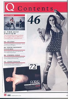
USE - The 'Spin' contents page helped me a lot while creating my contents page, I placed my model on the edge of the page so that she was on the edge but also in the middle just like the 'Spin' contents page. I took a long shot photo of my model to let the readers see what pose she's doing and what she's wearing. I included a quote in the corner of the page too, but i used black font instead of white because the background was too bright to use it with and i was trying to keep up with my three colours (Pink, Purple & Black).

DEVELOP - Instead of placing the Magazine's Logo at the top, I titled the page 'Contents' because if I placed my Magazine Logo at the top it would take away the focus from the model and it would add too much colour too the change, so i thought black bold font was a good choice. I was going to do my Features & Exclusive columns just like the 'Spin' contents page but I wanted to make it look more presentable, so I made the columns transparent and again used black bold text. The 'Spin' contents idea gave me and idea to add a bold rectangle in  the corner of the page but for my magazine it would be a competition to give my readers a chance to win tickets whereas in the other contents page it just told their readers who the photographs were taken by.

CHALLENGE - Making my Features, Exclusive & Editors Note was hard to do because i had to pick a colour that would help to make it stand out a bit more and the only option I had was to use a white column and make it transparent, so I didn't stay with the three colour rule on this page.

USE - The Double Page Spread next to mine gave me some good ideas, I used two different fonts for my masthead which is creative and eye-catching because readers will notice the change in font an font size and will read the interview and also the photo of my model uses up one page just like the one on the right. I have used two colours for my interview which will be easier to read as the readers will know who is talking and asking the questions.

DEVELOP - Instead of adding a full size photo of my 'popstar' i decided to advertise an album instead as it will persuade my readers to buy it and listen to it. I wanted to include a quote from the interview so i placed it right in the middle of the the columns, the black bold text from the other double page spread gave me this idea.

CHALLENGE - The background on the professional magazine was just a white background whereas mine was a Union Jack which wasn't easy to do as I had to pick the right colours to blend well with my model and her outfit. Fitting the text into columns was not easy either because I had to make sure all the text was the right size to fit into a column each.


Wednesday 20 February 2013

Research & Planning - February Improvement 2

Here is my better and improved magazine!
Front Cover
Contents Page
Double Page Spread


Research & Planning - Latest Improvements to My Double Page Spread

Not much has changed for the Double Page Spread


Before
I have....
  • Designed and Included an album, promoting it.
  • Changed the 'Gemma Davies' Font 
  • Darkened the models shadow
  • Included 'Written by Sarah Goodwin'

Research & Planning - Latest Improvements to My Contents Pages

I have made A LOT of changes to this page because i didn't think it looked like music Contents Page before.


(The after is in the next blog post)

 I have.......


  • Included an Editors Letter and also included a photo of me 
  • Changed the Contents Bar 
  • Removed the photos of the two models and make up
  • Put the features column and exclusive column together
  • Added a quote from the model currently posing
  • Included a Competition with my concert tickets that i have bought recently.


Research & Planning - Latest Improvements to My Front Cover

Before
On my Front Cover I have......

  • Made the Cover lines & Sell lines bolder and in Italics
  • Used a lighter shade of Purple (Throughout the whole magazine) because I thought the purple i used before was to bold.
  • Changed the font to black instead of white (White isn't one of my 3 colour scheme choices) and I've also used a quote form the 'Popstar' (Model on the front cover) instead of advertising the album because I've already advertised it inside the magazine.

Before
After


Another magazine has put a quote inside the circle


Tuesday 19 February 2013

Research & Planning - Inspiring Contents Pages

Which magazines helped me to improve my magazine?
  • Only one photo of Musician/Band
  • Features column on one side
  • Title contents at the top of page
  • Underlines e.g. Features

http://caitlinreidy.files.wordpress.com/2012/09/qcontents1.jpg?w=337&h=382 


http://caitlinreidy.files.wordpress.com/2012/09/spinmagazinecontents.jpg?w=442&h=548 


http://cbracechs.files.wordpress.com/2012/01/spin-contents-page.jpg


Research & Planning - February improvement


Sunday 17 February 2013

Research & Planning - Page Furniture

Usually in Contents pages you see:-

 And Double Page spreads have:-

This blog post will help me to improve my pages even more.

Research & Planning - My Album Cover

Used an Image of Model 1, she is wearing a different outfit and her hair is also different to her past photos, which are in my magazine. This model is new Popstar, and my magazine is interviewing her and also promoting her first album which is about love.


I have used a basic photo to use for my CD Cover


I went on Photoshop and made a 12 x 12 cm template for my album. I cut out the background behind the model to a plain white.


Then I changed the images colour to black & White


Add finally i added on some text, the white text will make the models popstar name stand out and i've used red on the name of the album to tell the readers what the album is called and to also symbolize love, which is theme of this CD.

Research & Planning - Album Covers

Here are some pop artists albums, they will inspire me and help me to make my own album for my magazine.


I want to do my album in black and white because I think it will stand out to the readers, i also wanted to add some red to the cover to make the album vibrant and perhaps symbolize love because my 'Pop' artist has made an album dedicated to love.